A migration story: from blogofile to hugo
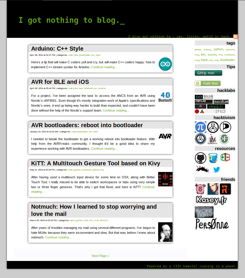
It’s been a long time since I last posted on that blog. Besides the fact that I’ve been too busy to update it, it’s also because it was stuck in 2009.
When I first heard of the concept of static site generator I was very
excited, so I used the first tool that existed — Blogofile. I hacked together
a site, made nice looking URL (on the nothing.to/do scheme 😉) , and made my
site xhtml 1.0 compliant (as was the hype at the time), and integrated my
existing dotclear theme into blogofile’s templates.
But since 2009, a lot of things changed. HTML5/CSS3 has taken over the world, displays’ resolution got much better and the kind and screen size of devices on which you look at a website became a lot more diversified. The adaptive design looks were’nt fit anymore… So what was then a comfortable and easy to read blog, became an unreadable ugly website in just a few years. Thus an upgrade of the look’n feel was needed.
Then another issue appeared, since I developed the first version of my blog, I kept it up to date with blogofile with ease. But many parts of blogofile broke between v0.7 and v0.8, meaning that upgrading the engine would mean a major rewrite of the code. That made me consider engine alternatives…
Not long before I decided to revamp my blog, my friend Dimitri told me how happy he was using Hugo. I also considered other options, from Pelican to Jekyll. What eventually drove me towards Hugo has been that it featured a hundred of modern-looking themes, and that I was curious about discovering The Go language, on which I had good feedback.
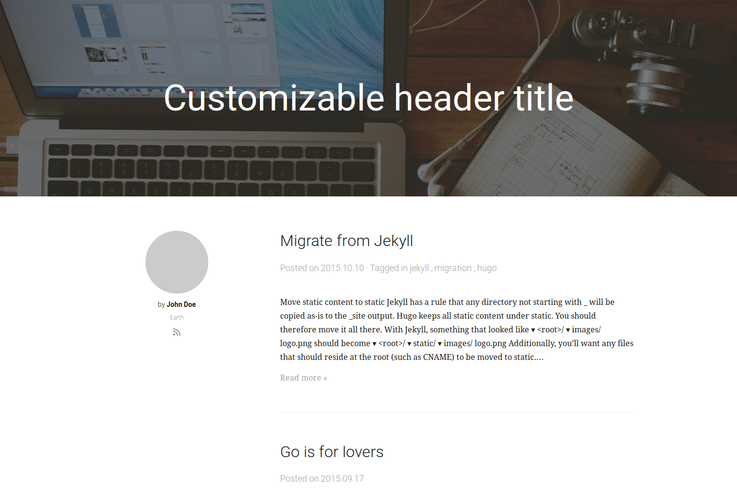
And there I was, following the quickstart to compile and install the tool, browsed through the hundred themes to find the one that met the minimal requirements I had — non-compiled CSS, responsive design, focused on reading comfort, and with a hack friendly license. So, the one I found matching most of those criterias was minimalist’s theme from @rriegger as adapted to Hugo by @digitalcraftsman.
And there the fun begun. I took all my old markdown files and moved them in the
content folder. I’ve patched them to add the aliases parameter, so I could make sure
I wouldn’t break the web, switched from the odd old $$code format for codes, to have
proper original markdown support (I would still need to choose an highlighting strategy
at some point), and that was done.
Then I went on to hack the theme to make the site header smaller, remove the “about”
part on the left of the articles — this blog really is about my hacks — and moved
the social-stuff icons to the top right, so they’re there but not in the way. Doing
so, I had some fun implementing the blinking cursor (because <blink> forever!)
and give it the same look my old Amstrad CPC6128 had.
So after some google search, I found a neat tip to make neon glow, that once
a bit reduced would make a perfect case for CRT glow. Then I made the
background having some green halo, to feel like the old bubbly CRT of the
Amstrad, using a radial gradient as background property of the header.
.site-header div {
    background-image: radial-gradient(ellipse farthest-corner at 50% 50%,
                            rgba(0, 180, 0, 0.2) 0%,
                            rgba(0, 120, 0, 0.1) 50%,
                            rgba(0, 80, 0, 0.3) 75%,
                            rgba(0,0,0,0.5) 100%
                    );
}
I also wanted to give the same texture that old CRT had, so I borrowed from that demo the pixel lines overlay (but skipped on the flicker and on/off effects… as it’d be a bit too much ☺). As sophisticated that demo looked, actually all I needed was to add:
.site-header h2::before {
    background: linear-gradient(
                    rgba(18, 16, 16, 0) 50%,
                    rgba(0, 0, 0, 0.25) 50%
                ),
                linear-gradient(90deg,
                    rgba(255, 0, 0, 0.06),
                    rgba(0, 255, 0, 0.02),
                    rgba(0, 0, 255, 0.06)
                );
}
To make it complete, I found:
” The Amstrad font “
on Fonts2u drawn by Wesley Clarke, who I thank as he made it free to use.
I finally hacked together the tag cloud, using a CSS hack, added the path within the blog within the navigation partial. And I was almost done…
Almost, because I ran into a huge issue, as reported on the hugo’s forum. My
problem was that either I root my blog at /blog and all my URL are like
i.got.nothing.to/blog/hack/on/stuff, or I don’t and the default URL is
i.got.nothing.to/ and then the URL are like i.got.nothing.to/hack/on/stuff.
What should have been an easy change, became a major wall I hit.
I finally solved that issue by adding a blog section, and a single post that will
get ignored, and which will list all data. Then, I made the index page a redirect
to the /blog path. And it was almost done!
I’ve also added a neat feature that enables you to edit the articles on both github or gitlab, by clicking on the logos on top or bottom of the page ! And when I do tweet about an article, you’ll be able to reply to that tweet by clicking the link below !
To make my setup complete, I had to be able to publish with a simple git push and
I had that possible thanks to gitlab and the external CI runners! I only had to add
the .gitlab-ci.yml
which contains the hugo -d ~/www/nothing.to command to deploy the site, ran as www-data! 👌
So now, I’m happily blogging again, thanks to that blog propelled by the hamster in a wheel!


